Jolla: Slight Changes To Handset Design

Here is some exciting design related news picked up by sharp readers/commentators Olivier and Thoke.
From the images below it is evident for all to see that Jolla have indeed been busy beavering away to tweak the prototype design that we originally got a chance to see earlier this year.
Below is a photo of the new handset render:
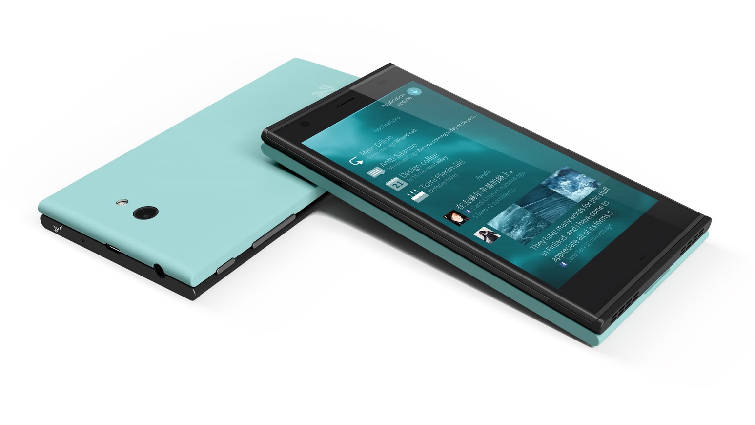
New Jolla Handset Design Render
For comparison, here is a photo of the original prototype:

Original Jolla Prototype Render
The major changes that are immediately noticeable are that volume/power buttons have been moved to the RHS making it easier to find with your thumb (if you are right handed). This is the same layout as the Nokia N9 which will have that familiar feel to many upgrading from the MeeGo Harmattan device.
Another big change is also that the camera lens/led have been moved to a central position which will mean less chance of taking that dreaded “my-finger-got-in-my-lens-and-ruined-it” photo.
The rear ‘other half’ Jolla signature has also been relocated to a central position to match the new camera lens position.
There also appears to be a small hole now on the top side where a hole was originally located near the lens section which we are assuming is a microphone?
The bezel (especially top side) appears to be reduced and the look of the screen now has much more balance to it considering the overall design.
The front facing camera and what we are assuming is the proximity sensor have both been moved out a little so there is less crowding around the ear piece.
Finally is it me or does the overall design appear thinner ? It could be that the ‘pillow’ effect is just less pronounced – either way, it looks cleaner which can only be a good thing.
What do you think of this latest render ?
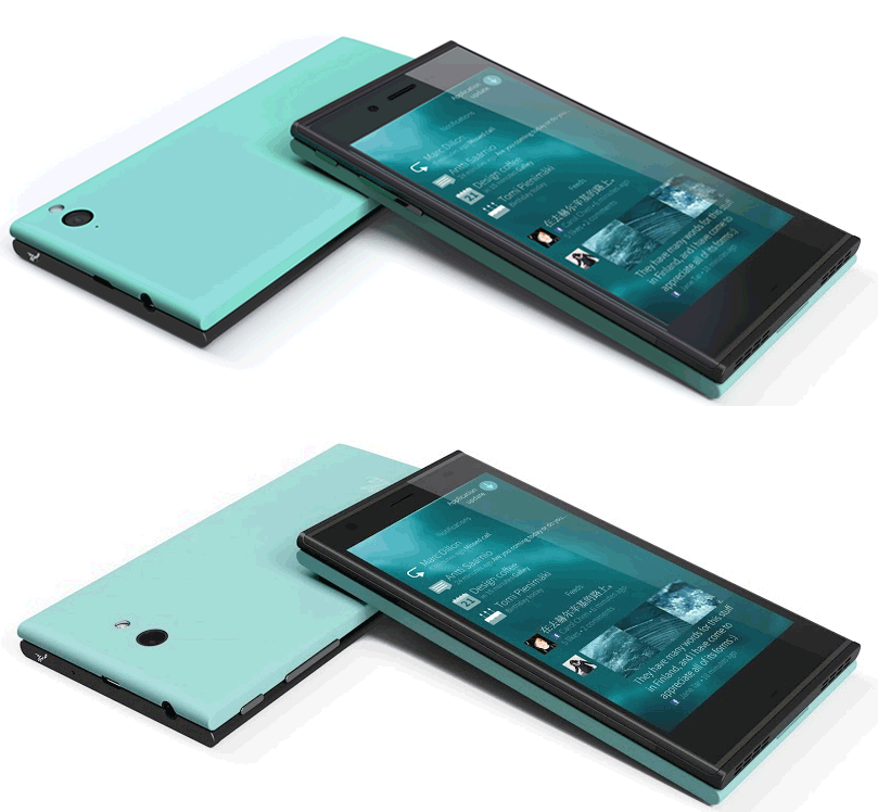
EDIT: I’ve just realised what it is about the appearance that looks different. If you look at the original prototype (2nd image), you will notice a slight gap at the join especially down the sides between the 2 halves like they don’t quite seamlessly fit together. Now look at the new render (1st image) and that gap is barely visible down the sides. This explains the fact the new render also looks thinner because the gap has been lost. ;-)


Latest posts by jollatides (see all)
- Jolla: Weekly News Roundup V2 - October 30, 2013
- Jolla: Weekly News Roundup - October 21, 2013
- Sailfish: The App Story To Date - October 18, 2013


 Joonaksu on

 Praveen kumar on
 Uli S. on


 Robert Southern on



I think it’s a way better design!
Especially the camera in the middle is a big improvement. This prevents one from accidentally touching the camera with dirty fingers.
P.S.
I did a quick calculation to compare the pre-orders of Jolla with Ubuntu Edge.
I don’t know if this is a fair comparison so I’ll post my calculation with it:
$12,500,000.00 / $695 = 17,985.611510791366906474820143885
which is significantly less than the pre-orders of Jolla.
What will happen to Ubuntu Edge if they don’t succeed?
They still have raised about $12,500,000.00
It’s better but differences are not very significant. That would be nice if people that attended the Jolla Love Day, could compare to what they tested (the real prototype was slightly bigger) and evaluate the “gain”…
@Determinist: for the Ubuntu Edge, they will refund us, that’s all. That was about 15 / 17 000 units yes (because there was also perks for t-shits, consideration…)
Latest on Ubuntu Edge is:
http://www.bbc.co.uk/news/technology-23793457
So that’s one of my options down the pan, for now. I’ve got an Android but I’m still using my N900 as my main phone, simply because I hate Google’s “What’s yours is ours” attitude and all the bloat they’ve packed Android out with. Couple that with the network provider’s bloatware and you can see why Android’s requirements are exceeding that of a desktop PC.
Can’t wait for Jolla to get their devices on the shelves.
Looks like the buttons have moved from the left side to the right.?
Richard
“The major changes that are immediately noticeable are that volume/power buttons have been moved to the RHS making it easier to find with your thumb (if you are right handed).”
RHS = Right-Hand Side.
Pingback: Jolla hioo puhelimensa designia – katso muutokset kuvista : Mobiili.fi
This might upset a few people – hardware keyboard fans might want to sit down and breath…
Surely, putting the camera in the middle of the otherhalf makes a slide out keyboard trickier?
Before, when the camera was on an edge, the keyboard and mechanism could avoid most of the camera and you could have quite a tall keyboard or even 5 rows of keys.
I noticed that as well but thought maybe they could just put a hole in the section of the keyboard where it closes…. or even better an additional camera lens module integrated into the keyboard for better quality snaps! ;-)
This issue, caused by the new place of the camera lens, can be solved. Please read http://talk.maemo.org/showthread.php?p=1381779#post1381779
And it wouldn’t affect a folding style keyboard that folds into the screen to protect it. But I agree it would definitely require some extra thought.
Considering that the camera has a wide-angle lens (about 72 degrees, from left edge to right edge, or diagonal?), it may be difficult to buid an OH without a hole in the folding keyboard à la E7 and N950. And the photographing position would be cuite awkward or silly-looking, especilly for portrait photos.
I wonder from which source these images do derive as on the official jolla website there are still the same renders as of may 20th.
good design Jolla
sub.
I know Jolla is not into spec race but How much ram Will it Have ?
We don’t know for sure yet…
But if it’s anything like the N9/950, RAM is one thing they won’t compromise too much on.
Pingback: Jolla: piccole migliorie al design | JollaIt
You can see the difference in GIF file at http://dreevoo.com/download/dreevoo_jolla_old_new.gif
Thanks Nikman – I’ll edit to add that file as it shows the differences really well! :-)
You are welcome :) Feels good to see the pic in article :)
Wise changes :)
Aye.
(Wearing my t-shirt proudly,) I have to say: I love Jolla and can’t wait to hold this newly designed piece of hardware in my hands.
But, I have to admit that it would have been great, if one the speakers now would have been moved to the opposite side of the device.
My beloved N900 “wears” it’s speakers like this and for me this is the most reasonable arrangement for stereo speakers – especially if you think of watching video content …
Greetings from germany.
So put that directly to Jolla, no point putting it here…
Personally, I think you’re right …
… but after reading http://jolla.com/unsolicited-ideas-terms-and-policy/ I’m not sure if doing this would make any sense.
i’m very interested in this phone.
But it looks SOOOOOO UGLY.
Mainly because i get that “it doesn’t fit” feeling from the back cover.
i’d love to try one with my hands, and if i end up buying, i’d surely ask my friend who bought a 3d printer to print me a fitting back cover.
Also, i hope to see the specs of it, since it’s Linux-based i’d love to chroot install Debian like a friend showed me a couple of years ago on his N900, and maybe connect it to a monitor ;)
Cheers!
Design is better than previous for sure. The color tone is also better. But, I’m worried about the thickness a bit. Hopefully it’s not at least any thicker than my Lumia 820 which I’m hopefully being able to trash in favor of Jolla device.
Me too. I wonder if a pillow-shaped other half that makes the device feel thinner in the hands would be a possibility. Or if the device is useable without an other half.